Prelim: Fashion Magazine Moodboard - Genre Research
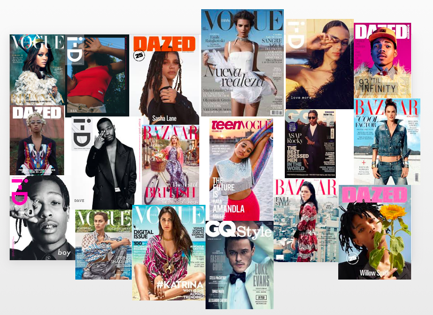
The fashion magazine covers displayed above represents the look and genre of fashion i want my product to carry. For example a cover which displays a similar vibe to what i want my work to represent is the Dazed magazine featuring Willow Smith (bottom right). This is because of the lighting and props used to display a naturalistic sense. The simple text may be something i would expand on as i want my work to inform the reader of its contents as well as look visually pleasing. The effortless colour scheme allows the reader to concentrate on the subject of the image without being confused by a busy display. It brings the piece together as all colours link to a shared theme and essence. However in order to display more of a fashion aspect I would change the shot size to medium/long shot exhibiting the clothing choices. For example in the teenVogue cover (centre of board) a medium long shot is used showing the models fashion style. This allows the reader to see the taste of the magazine and if they further want to subscribe to the company.
In terms of fonts i prefer a font like i-D as it is simplistic and not overpowering but still carries its own persona. In the i-D magazine near the top right of the moodboard the masthead is in white. This makes it bold and clear, similar to i-D's other covers where they use unique colours like pink for their masthead (A$ap Rocky - bottom left).
For my magazine i want a similar genre to these magazines - a naturalistic and unique vibe. I want the product to appeal to todays youth who value fashion which expresses the individual. This would contrast with a real life location instead of an image taken/placed on a plain background with studio light.


Comments
Post a Comment