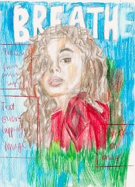
Prelim: Magazine Flat Plan
Front Cover:
This was initial magazine design and layout. I
decided to use this pose as its simplicity of the sot allows the viewers to not
only see the model clearly but also the clothing through the low shot. It also
shows the model as more dominant and in control of the photograph. This
therefore presents her as confident which portrays the message of maturity
within the younger generation I want to translate through my work. The masthead
- 'Breathe - appeals to the target audience as it encourages teenagers, aged
14-18, to take a break from stress and work and 'breathe'. This is significant
as it plays into the convention that teenagers are always stressed from work
and deserve breaks from reality, which my product will hopefully provide.
The final photograph in the picture may include a different pose but I definitely want to set it in an outside location so it can again relate to the masthead and vibe of the product. It will also provide a natural light to the picture and the model adding to the naturalistic feeling of the cover.
The colour scheme of the magazine will be alternated according to the outfit of the model. Following this I will make sure that the colour of the font will match with the masthead and the clothing of the subejct. This will help bring the whole piece together and give an overall theme to the piece.
The font of the cover will be san serif in order to appeal to the target audience who will appreciate a more relaxed and informal atmosphere. It will play in to the message of the cover - escaping formality and serious work.
The graphic used will allow this issue to differ from other magazine covers of the same brand, appealing to my audience.


Comments
Post a Comment